

For some time now, charting data in Excel has become not only simple but also automated to the extent that you can easily go from a tabular spreadsheet to a comprehensive area, bar, line, or pie chart in no time with a few well-contemplated mouse clicks. Then as you edit the data in your spreadsheet, Excel automatically makes corresponding changes to your charts and graphs.
That’s not the
end of the program’s charting magic, though. You can, for example,
change the chart or graph type at any point, as well as edit color
schemes, the perspective (2D, 3D, and so on), swap axis, and much,
much more.

But, of course,
it all starts with the spreadsheet.
Laying Out
Your Data
While Excel
allows you to arrange your spreadsheets in many ways, when charting
data, you’ll get the best results laying it out so that each row
represents a record and each column contains elements of or
pertaining to specific rows.
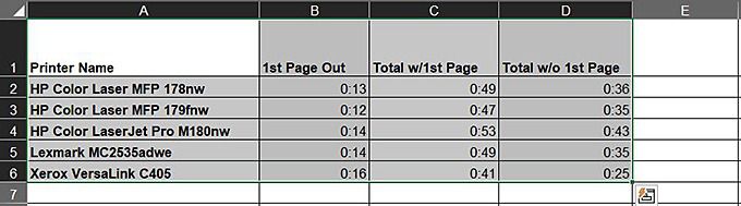
Huh? Take the
following spreadsheet, for example.

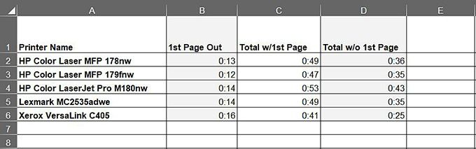
The far-left column contains a list of laser printers. Except for Row 1, which holds the column labels, or headers, each row represents a specific printer, and each subsequent cell holds data about that particular machine.
In this case, each cell holds print speed data: Column B , how long it took to print the first page of a print job; Column C, how long it took to print all pages, including the first page; Column D, how long it took to churn the entire document, sans the first page out.
While this is a
somewhat basic spreadsheet, no matter how complex your data, sticking
to this standard format helps streamline the process. As you’ll see
coming up, you can map the cells in a small part of your spreadsheet
or chart the entire document, or worksheet.
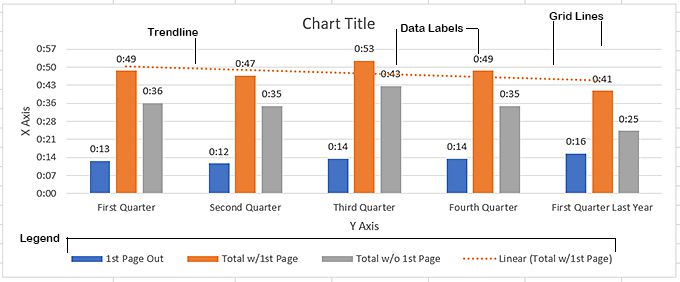
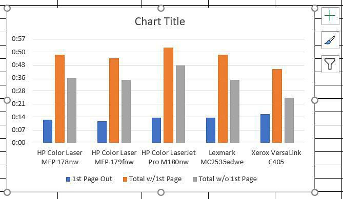
The typical Excel
chart consists of several distinct parts, as shown in the image
below.

Charting Your
Data
If you haven’t
done this before, you’ll probably be surprised at how easy Excel
makes charting your spreadsheets. As mentioned, you can map the
entire worksheet, or you can select a group of columns and rows to
chart.
Say, for example, that in the worksheet we were working on in the previous section that you wanted to chart only the first two columns of data (columns B and C), leaving out column D. This entails a simple two-step procedure:
- Select the data you want to chart, including the labels in the left column and headers in the columns you wish to include in your chart, as shown below.

- Press ALT+F1.
Or, to chart the
entire spreadsheet, follow these steps.
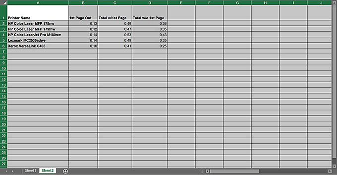
- Select all the data in the spreadsheet, as shown in the top image below. Do not select the entire sheet, as shown in the second image below—select only the cells containing data.

 Right
Right
 Wrong
Wrong- Press ALT+F1.

Excel does a
great job of choosing the appropriate chart type for your data, but
if you prefer a different type of chart, such as, say, horizontal
bars, or perhaps a different color scheme, maybe even a 3D layout
with gradient fills and backgrounds, the program makes all these
effects and more easy to achieve.
Changing Chart
Type
As with
everything else in Excel, there are several ways to modify your chart
type. The easiest is, however, to.
- Select the chart.
- On the menu bar, click Chart Design.
- On the Chart Design ribbon, choose Change Chart Type.
This opens the
Change Chart Type dialog box, shown here.

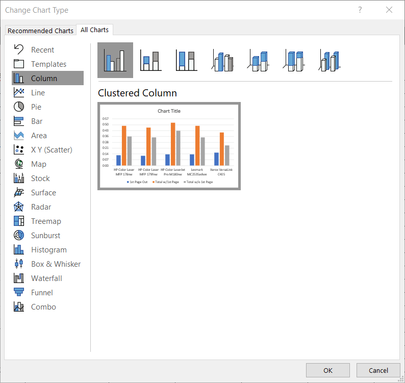
As you can see,
there are numerous chart types, and clicking one of them displays
several variations across the top of the dialog box.
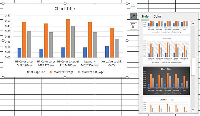
In addition to changing chart types from the Chart Design ribbon, you can also make several other modifications, such as color schemes, layout, or applying one of the program’s many pre-designed chart styles. Chart styles are, of course, similar to paragraph styles in Microsoft Word. As in MS Word, you can apply one of the numerous styles as-is, edit existing styles, or create your own.
Adding And Removing Chart Elements
Chart elements
are, of course, the various components, such as the title, the
legend, the X and Y axis, and so on that make up your chart. You can
add and remove these elements by clicking the plus symbol that
appears on the right side of the chart when you select it.

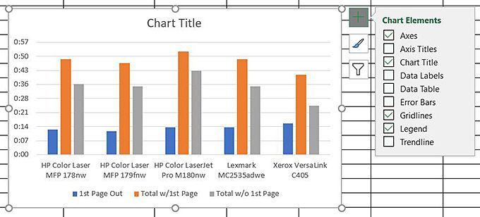
Beneath the Chart Elements fly out is the Chart Styles fly out, which displays when you click the paintbrush icon to the right of the chart.

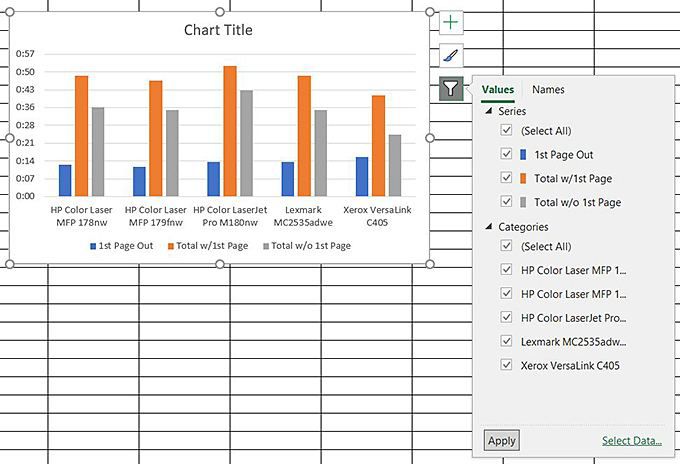
Beneath Chart Styles you’ll find Chart Filters, which lets you turn on and off (or filter) various components of your chart, as shown here:

If those aren’t enough modification options, there are a slew of others in the Format Chart Area to the right of the worksheet that lets you change all aspects of your chart, from fills and backgrounds to gridlines, to 3D bars, pie slices, drop shadows – I can go on, and on. But I’m sure you get the point as to what’s available.

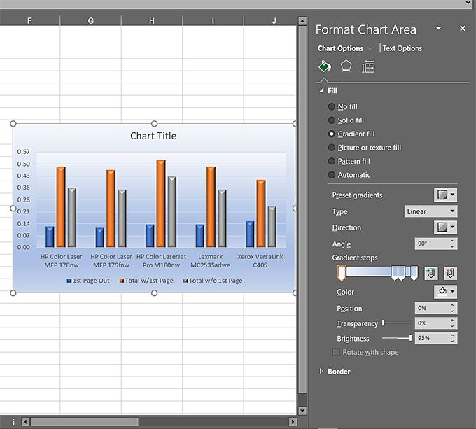
When you click Text Options, for example, you get another barrage of effects you can apply to the text in your charts. The options are almost unlimited, to the extent that without some restraint, you could wind up creating some garish-looking charts and graphs – without even trying all that hard, which brings me to an important design guideline.
Just because you have all these fantastic design tools at your disposal doesn’t mean you have to use them….or, well, not so many of them at the same time. The idea is to make your graphics attractive enough to catch your audience’s attention, but not so busy that the design itself detracts from the message you’re trying to convey. It is, after all, the message that’s important, not your design prowess or the brute power of your graphics design software.
A good rule of
thumb is that, if it looks too busy and distracting, it probably is;
dumb it down some. Don’t use too many decorative fonts, if any, as
they’re not easy to read. When using business-oriented charts and
graphs, concentrate on what you’re trying to say and not so
much on how you say it.
Meanwhile,
charting tabular data can render it much easier to understand and
much friendlier than column after column of text and numbers.