

Although Excel is capable of calculating a number of descriptive and inferential statistics for you, it is often better to show a visual representation of data when presenting information to a group.
Using Excel’s built in trendline function, you can add a linear regression trendline to any Excel scatter plot.
Inserting a Scatter Diagram into Excel
Suppose you have two columns of data in Excel and you want to insert a scatter plot to examine the relationship between the two variables.


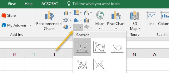
Begin by selecting the data in the two columns. Then, click on the Insert tab on the Ribbon and locate the Charts section. Click on the button labeled Scatter and then select the button from the menu titled Scatter with Only Markers.


In newer versions of Excel, the scatter charts will show up as a small button with a graph and dots as shown below. Also, you’ll choose just Scatter from the dropdown list.

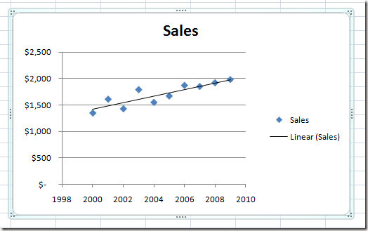
You should now have a scatter plot with your data represented in the chart.
Add a Trendline to Excel
Now that you have a scatter plot in your Excel worksheet, you can now add your trendline. Begin by clicking once on any data point in your scatter plot. This can be tricky because there are many elements of the chart you can click on and edit.
You will know that you have selected the data point when all of the data points are selected. Once you have selected the data points, right click on any one data point and choose Add a Trendline from the menu.


You should now be looking at the Format Trendline window. This window contains many options for adding a trendline into an Excel scatter plot.


Notice that you can add an Exponential, Linear, Logarithmic, Polynomial, Power, or Moving Average trend/regression type of line.
For now, leave the default Linear option selected. Click the Close button and your chart should now be displaying a linear regression trendline.

As with all things Microsoft Office, you can format your trendline to look exactly as you want. In the next section, we will discuss some of the more popular changes you can make to your trendline to make it stand out.
Formatting an Excel Trendline
To format your newly-created trendline, begin by right clicking on the line and selecting Format Trendline from the menu. Excel will once again open up the Format Trendline panel.


One of the more popular options people use when adding a trendline to Excel is to display both the equation of the line and the R-squared value right on the chart. You can find and select these options at the bottom of the window. For now, select both of these options.


Let’s say that we want our trendline to be displayed more prominently on the chart. After all, the default trendline is only one pixel wide and can sometimes disappear among the colors and other elements on the chart. On the left hand side of the Format Trendline window, click on the Fill & Line icon.
In this window, change the Width value from 0.75 pt to about 3 pt and change the Dash Type to the Square Dot option (third one down on the drop down menu). Just to demonstrate that the option exists, change the End Type option to an arrow.


When you are done, click the X button on the Format Trendline panel and notice the changes to your scatter plot. Notice that the equation of the line and R-square values are now displayed on the chart and that the trendline is a more prominent element of the chart.


Like many functions in Excel, there are virtually limitless options you have available to you when displaying a trendline on a scatter plot.
You can change the color and thickness of the line and you can even add 3D elements to it such as a shadowing effect (click on the Effects icon).
What you choose depends on how prominently you want your trendline to stand out on your plot. Play around with the options and you can easily create a professional looking trendline in Excel. Enjoy!