Ford in Germany has been offering the new Sync 4 infotainment system with the Mustang Mach-E since spring 2021. With the facelift for 2022, the solution is also available in the Focus. ComputerBase was able to try Sync 4 in both vehicles for the first time and was particularly impressed by the good Apple CarPlay integration.
Table of contents
- 1 Mustang Mach-E introduced new Sync 4
- Focus gets Sync 4 in widescreen format
- Ford creates a clear menu structure
- Apps never exclusively occupy the screen
- Android Auto and Apple CarPlay for Sync 4
- Google missed optimizations
- Apple optimizes CarPlay for large displays
- Google Maps forgets current route
- Sync 4 in Focus is missing a unique selling point
- Conclusion
Mustang Mach-E introduced new Sync 4
Admittedly, the Mustang Mach-E is no longer the very latest model from Ford, but the testing opportunities offered to the editors repeatedly thwarted other dates. But the Mustang Mach-E remains the only Ford vehicle to be offered with a vertically oriented 15.5-inch center console touchscreen running the new Sync 4. The series was recently expanded to include the sporty GT model. The F-150 Lightning with the same structure is currently not planned for Germany. The facelift of the Focus doesn't change that either, which also gets Sync 4 with the refresh, but displays the operating system on a more classic widescreen screen and therefore doesn't quite come close to the possibilities in the Mustang Mach-E.
-
 Mustang Mach-E GT as the latest electric model with Sync 4
Image 1 of 4 < /figure>
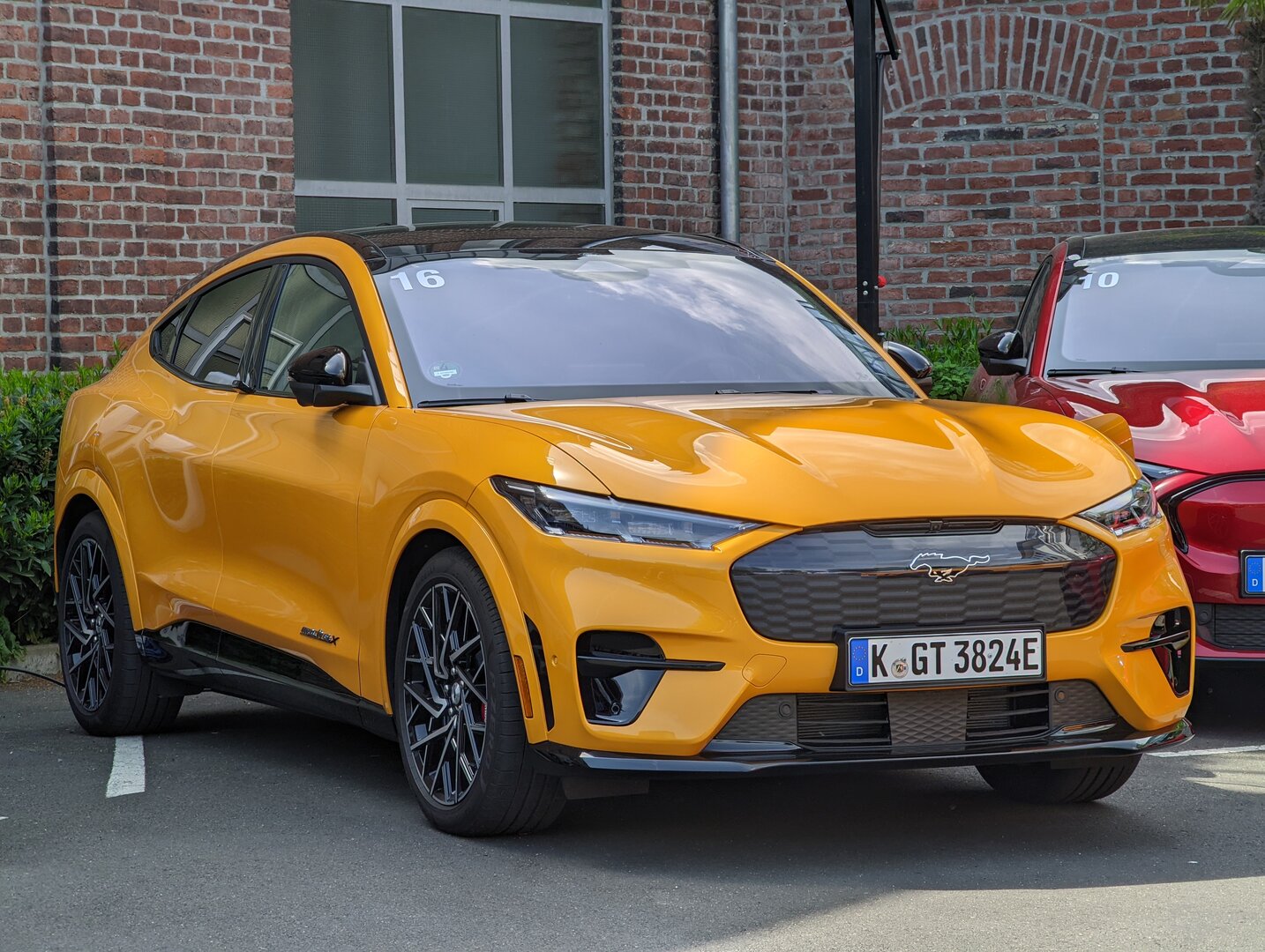 Mustang Mach-E GT as the latest E- Model with Sync 4
 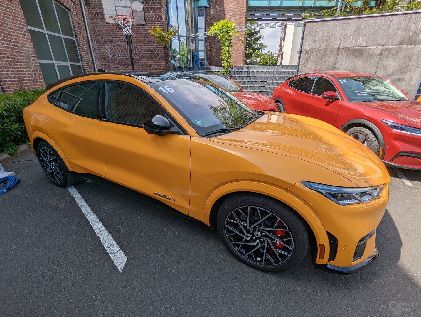 Mustang Mach-E GT as the latest E model with Sync 4
  Mustang Mach-E GT (left) as the latest E model with Sync 4
  Mustang Mach- E GT as the latest E model with Sync 4
 Focus gets Sync 4 in widescreen
On the one hand, the Sync 4 in the Mustang Mach-E can be classified as an unimaginative attempt to copy the infotainment system in the earlier Tesla Model S before the switch to AMD. On the other hand, one has to admit that a vertical screen in the vehicle has advantages, especially since Ford does not deliver a cheap 1:1 copy, but adds an interesting feature with the physical rotary control in the display. The vertical orientation of the screen, without sacrificing too much width, makes the many buttons easily accessible and allows elements to be distributed across tiles and generous spaces. The Sync 4 screen in the new Focus also impresses with a modern and clear display, but everything seems a bit more stocky, although with 12.3 to 15.5 inches there is supposedly a similar amount of diagonal available for content.
Ford creates a clear menu structure
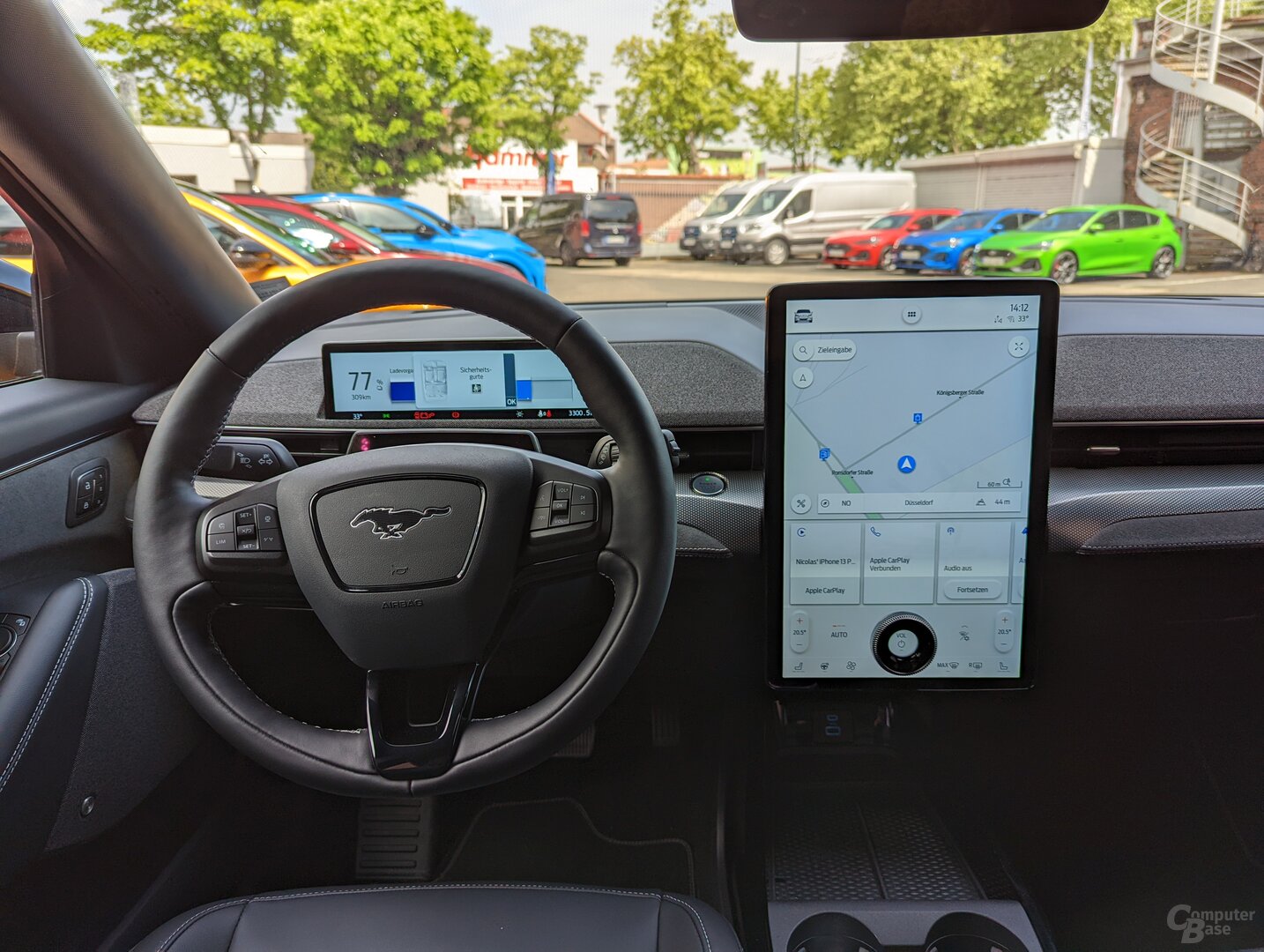
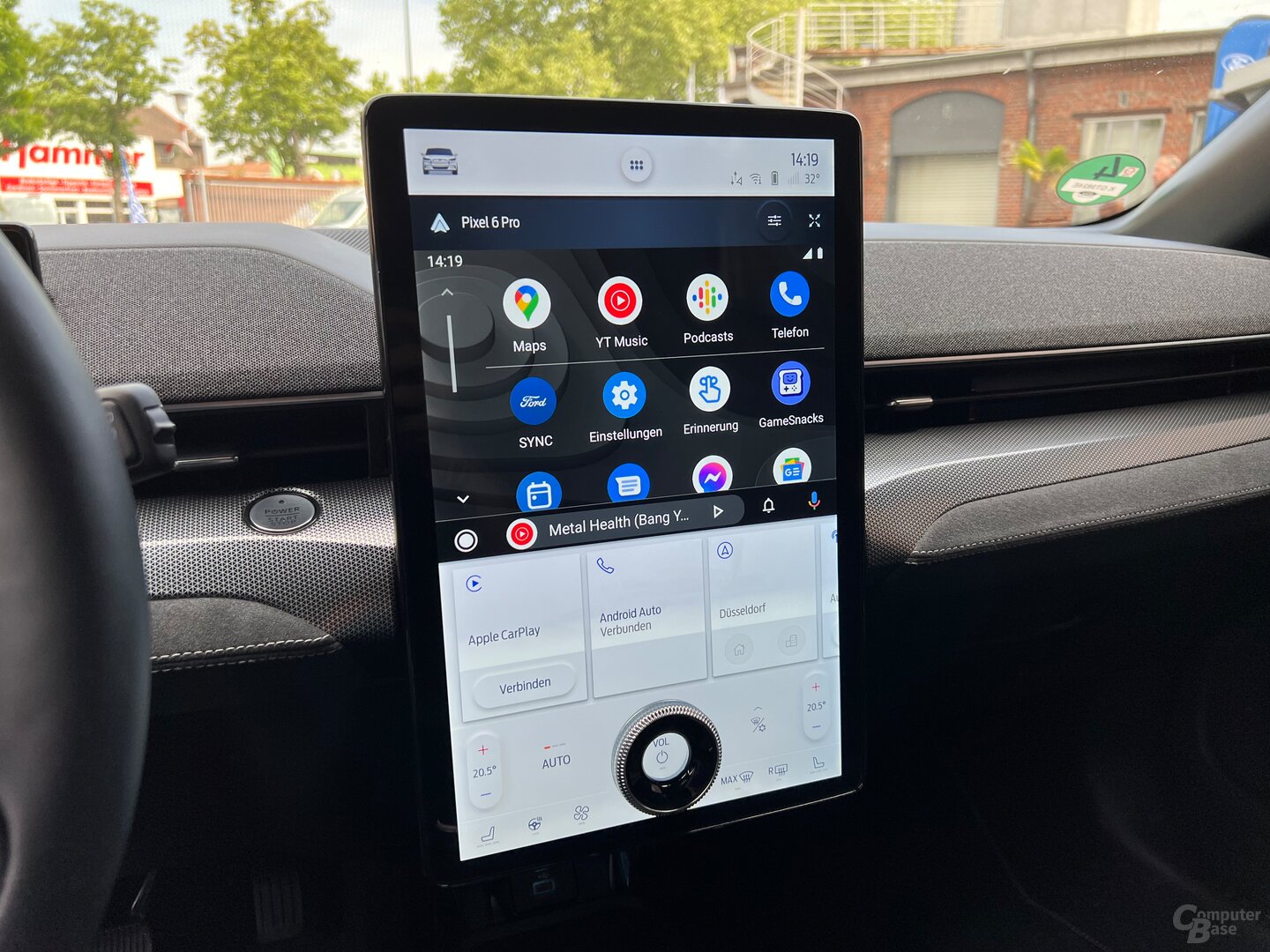
Ford's current operating system is divided into several static and dynamic areas in the Mustang Mach-E. At the top, users will always find quick access to all vehicle settings in a narrow bar, a kind of app drawer with the most important basic functions such as navigation, radio or smartphone connectivity, the connectivity of the car and smartphone, the weather and the current time. The large window directly below fills the app currently in use, with a button to switch between a smaller and larger view. The selected size affects the tiles directly below, which display the most recently called functions in chronological order so that they can be placed directly on the large tile above for quick access without having to search. One level down there is another static area in which Ford accommodates all air conditioning functions. No matter what is stated above, the air conditioning or seat heating is always at hand. The large rotary control for the volume is also located in this area, apparently floating on the display. One press mutes the system.
-
 Sync 4 on vertical 15.5″ in Mustang Mach-E
Image 1 of 4
 Sync 4 on vertical 15.5″ in Mustang Mach -E
 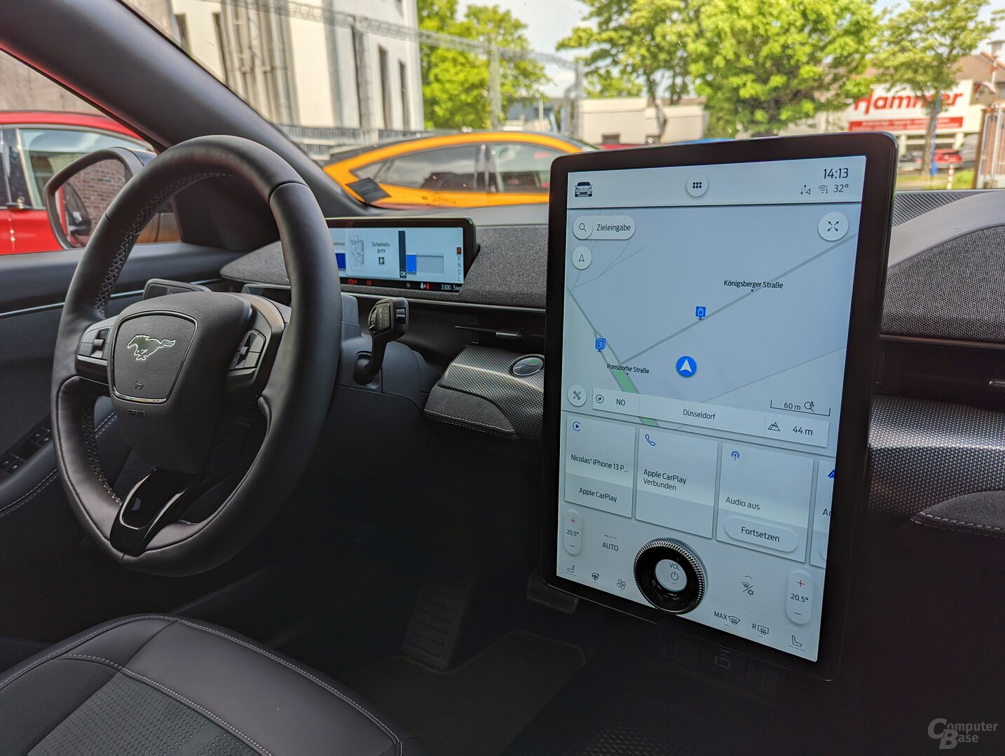 Sync 4 on vertical 15.5″ in Mustang Mach-E
 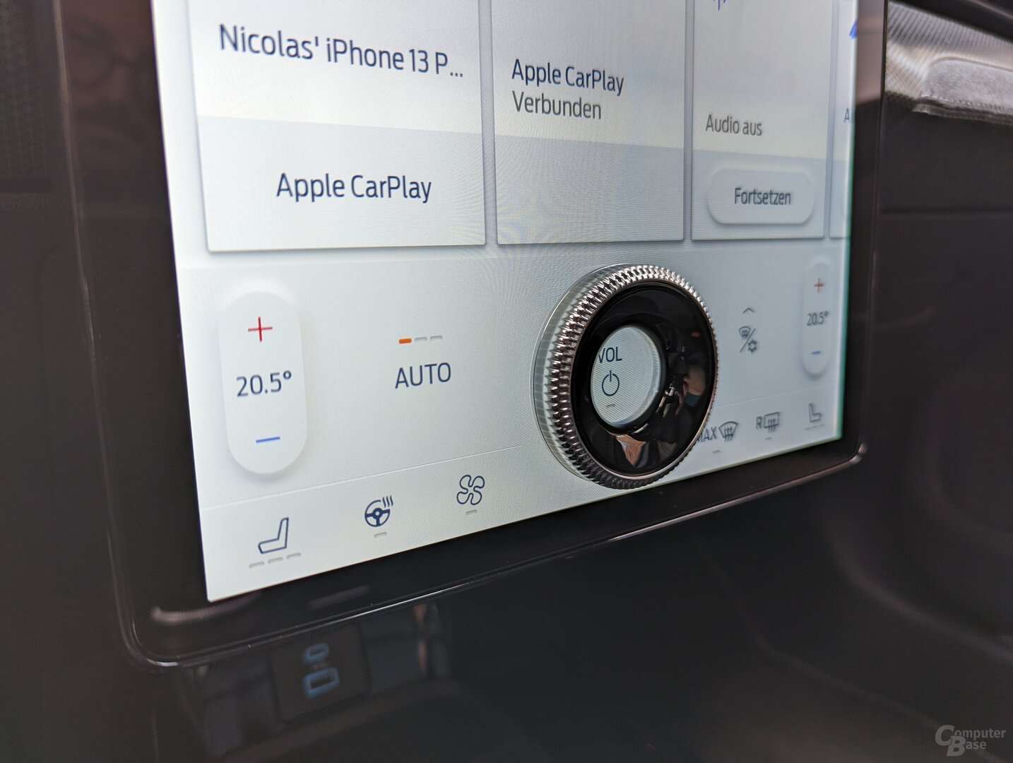 Control dial on the display as a special feature
 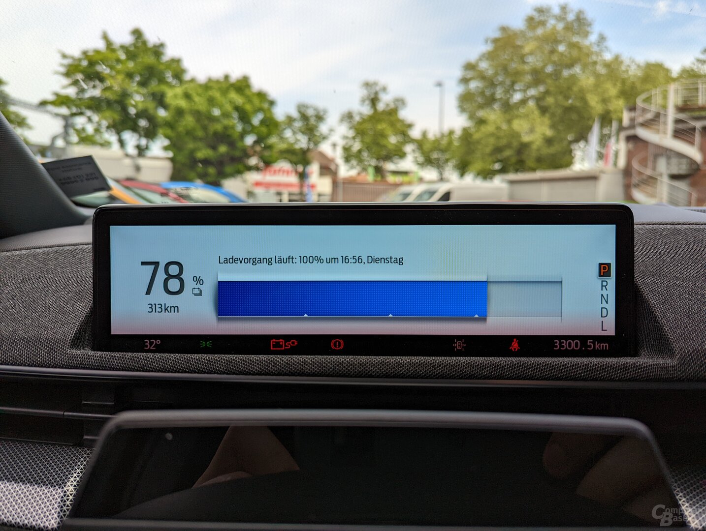 The driver's display with essential information about the car
Apps never exclusively occupy the screen
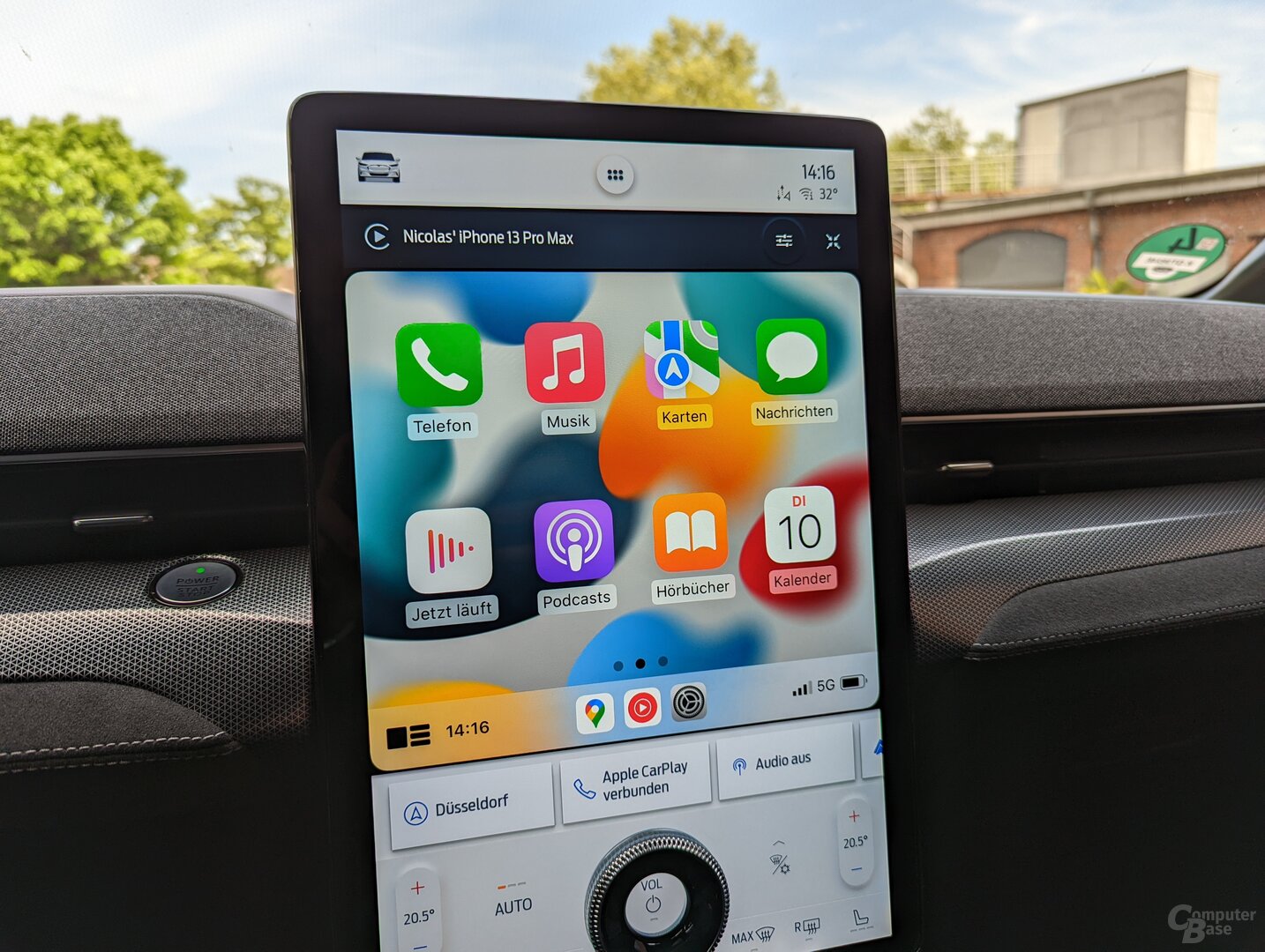
By using a large window for the currently active app and the parallel use of permanently assigned areas, Sync 4 gains a lot of clarity, since no application exclusively occupies the screen – not even remotely. Even with the large view for apps, there is still enough space available for the tiles for recently used functions. Settings on the car and the air conditioning have their dedicated areas anyway. This circumstance makes the implementation of Android Auto and Apple CarPlay interesting, as you are not thrown out of Sync 4 while using both solutions and therefore no button is required in either solution to return to the actual operating system of the car. However, Apple has an advantage over Google because Apple's developers have put a lot more effort into optimizing for large screens and alternative formats such as the Mustang Mach-E or the F-150 Lightning in the USA.
Android Auto and Apple CarPlay for Sync 4
Android Auto and Apple CarPlay are wirelessly supported in the Mustang Mach-E. At the same time, the smartphone can be charged in the charging cradle below the screen. Annoyingly, there is no space for two current and therefore usually very large smartphones next to each other. In any case, only the left-hand position for the driver is equipped with a charging coil. During the test drive, the iPhone 13 Pro Max (test) and Pixel 6 Pro (test) (each with a case) had to cuddle together and lay more on top of each other than next to each other.
-
 Android Auto under Sync 4
Image 1 of 3
 Android Auto under Sync 4
 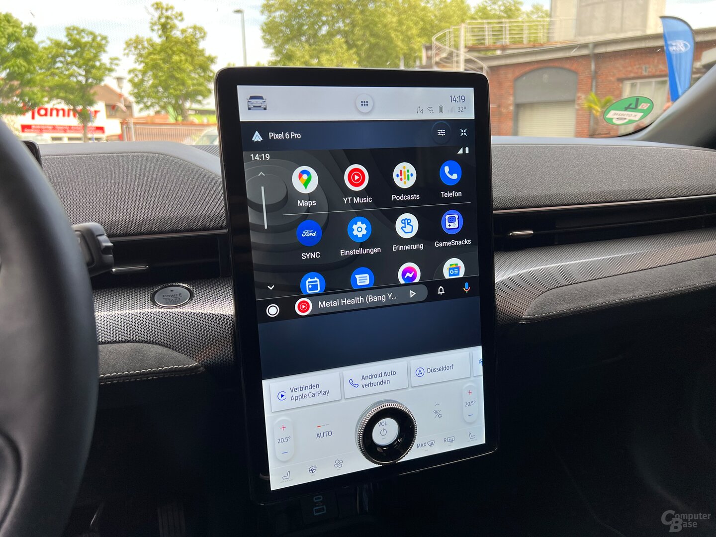 Android Auto cannot use the larger format
 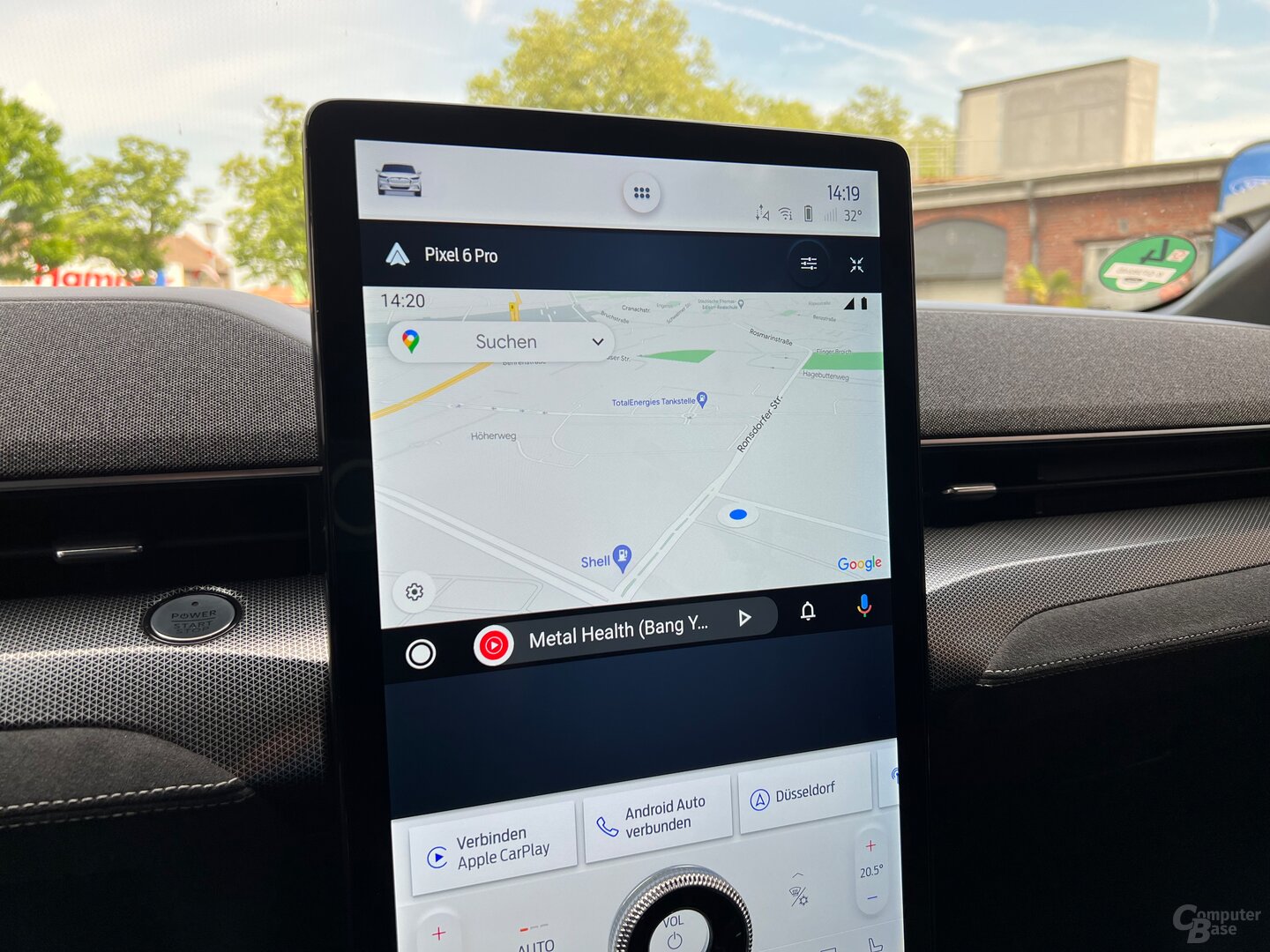 The Google Maps map does not get larger
 < p class="p text-width">Both solutions can be set up and stored in Sync 4, but cannot be used in parallel. If Android Auto is used, switching to CarPlay cuts this connection and vice versa. It is therefore not possible to connect two smartphones and then switch between the two solutions without interruption via the tiles of the apps used last. But at least Sync 4 remembers that both have been set up once, so apart from this “constraint” that one solution has to be terminated for the other, there is no forced pause. However, apart from tests like this in real use, it rarely happens that Android Auto and CarPlay have to be used in parallel.
Google missed optimizations
The fact that Sync 4 can switch between a smaller and larger view for the primary app also affects Android Auto and Apple CarPlay – both positively and negatively. If you press the button under Android Auto to enlarge the window, exactly nothing changes in the displayed content. Instead, the frame around Android Auto just gets bigger, but the display itself remains unchanged. As is so often the case with Google services, this underlines how neglected even their own apps are treated. Android Auto remains stubbornly standard and doesn't know what to do with the oversized screen of the Sync 4 in the Mustang Mach-E. However, the situation could improve towards the summer, because Google has announced a new UI and optimizations for screens of various formats for Android Auto.
Apple optimizes CarPlay for large displays
It's a completely different story with Apple: CarPlay isn't just being made one size bigger, it's been supplemented with a dedicated view especially for the large format. After the first connection of the smartphone, the standard format still reminds of the view on the MBUX 2 from Mercedes-Benz (test), so that a column with the time, connectivity, battery status, recently used apps and multi-window view also appears on the left for Ford, moves the large view down this column and makes it the bar that displays the same functions. The multi-window view can then display a large tile in landscape format at the top, while two almost square tiles can be found one level below. CarPlay cannot be displayed that large and so easily legible, even in the S-Class. Applications such as Apple Maps or Google Maps benefit in particular from this. Other apps like the calendar, on the other hand, are almost ridiculously large and need further optimization.
-
 Enlarged View for CarPlay
Image 1 of 8
 Enlarged view for CarPlay
 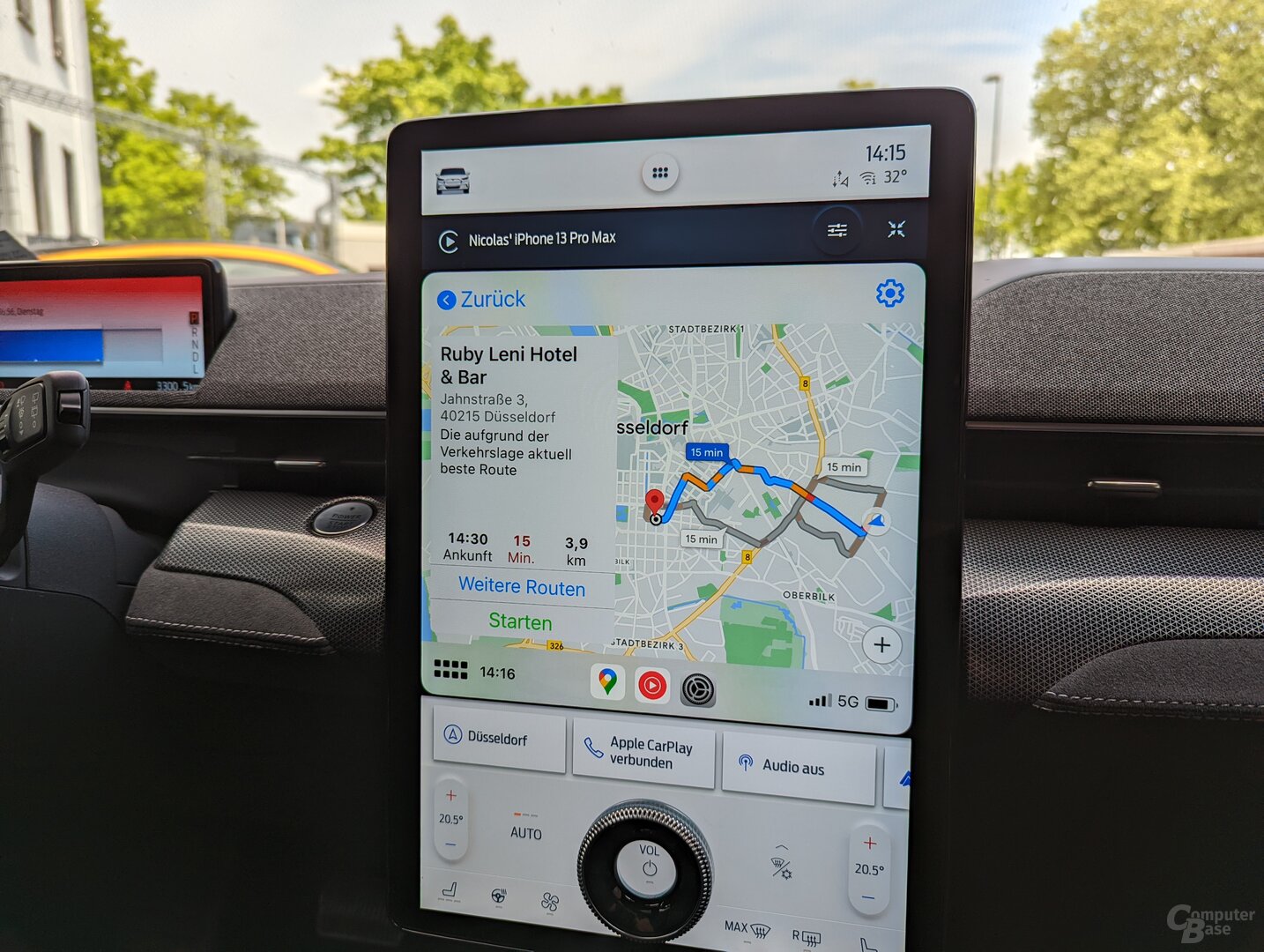 Very large Google Maps map on sync 4
 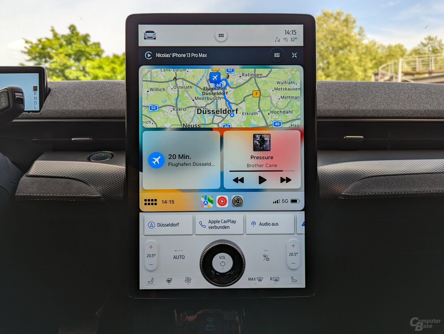 Alternative representation with tiles
 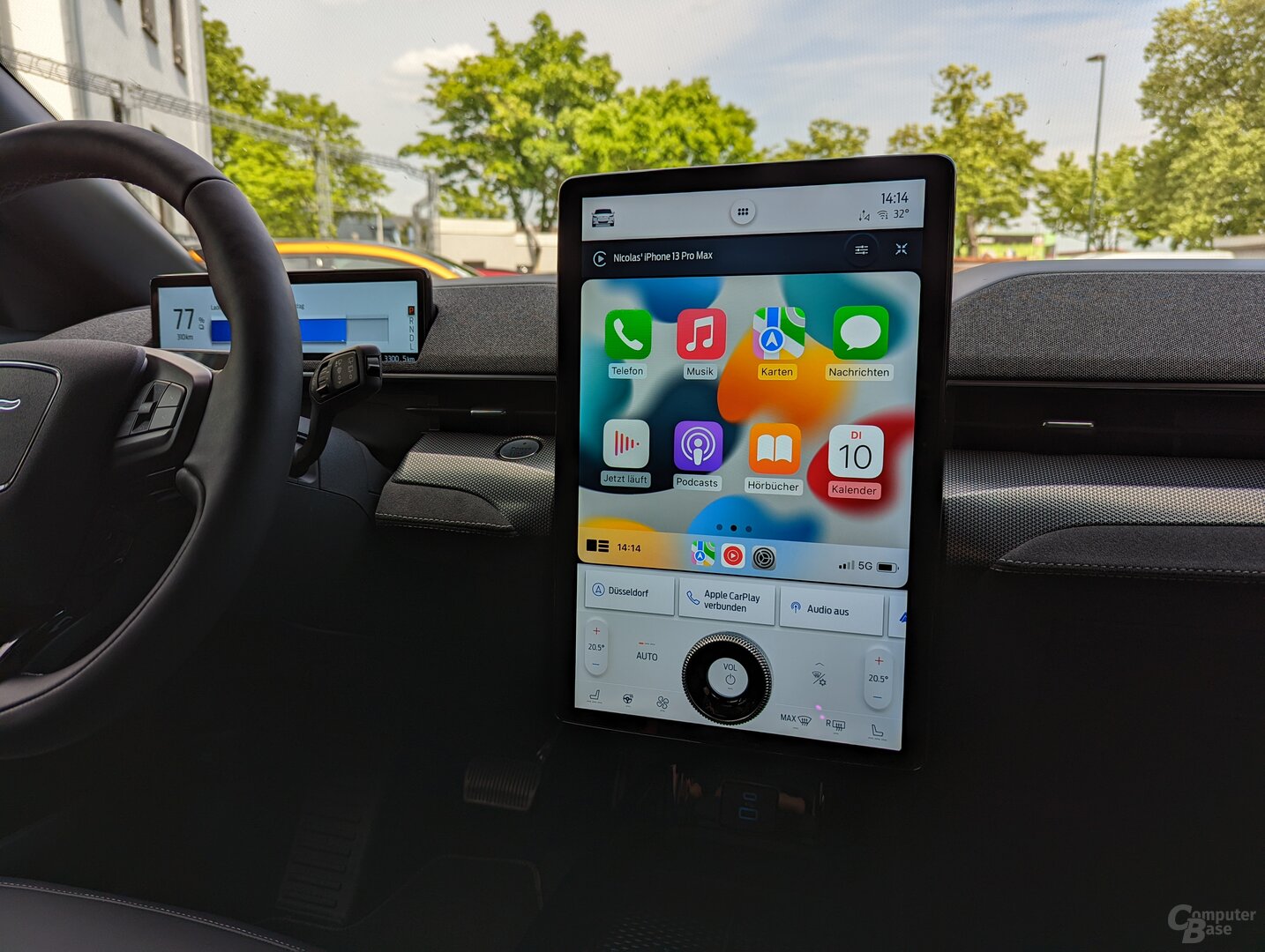 CarPlay under Sync 4
  CarPlay under Sync 4
 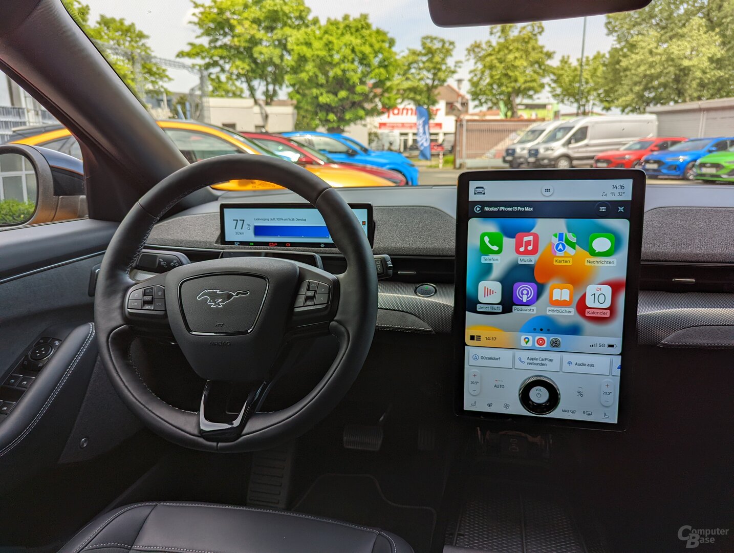 Enlarged view for CarPlay
  Default view of CarPlay
  Apple CarPlay under Sync 4
 Google Maps forgets current route
Especially when it comes to navigation, which is important in the car, Apple Maps copes noticeably better with switching between the two views than Google Maps. The background is that Google forgets the currently active route when changing and you have to start the navigation again each time. As long as you don't switch between views, Google Maps also runs smoothly. This could be because CarPlay performs a kind of soft reboot for the new format, since the CarPlay loading screen is briefly visible before the actual UI is displayed again. Google Maps potentially loses the last used information from memory at this very moment. However, other Google apps such as YouTube Music have no problem with the switch.
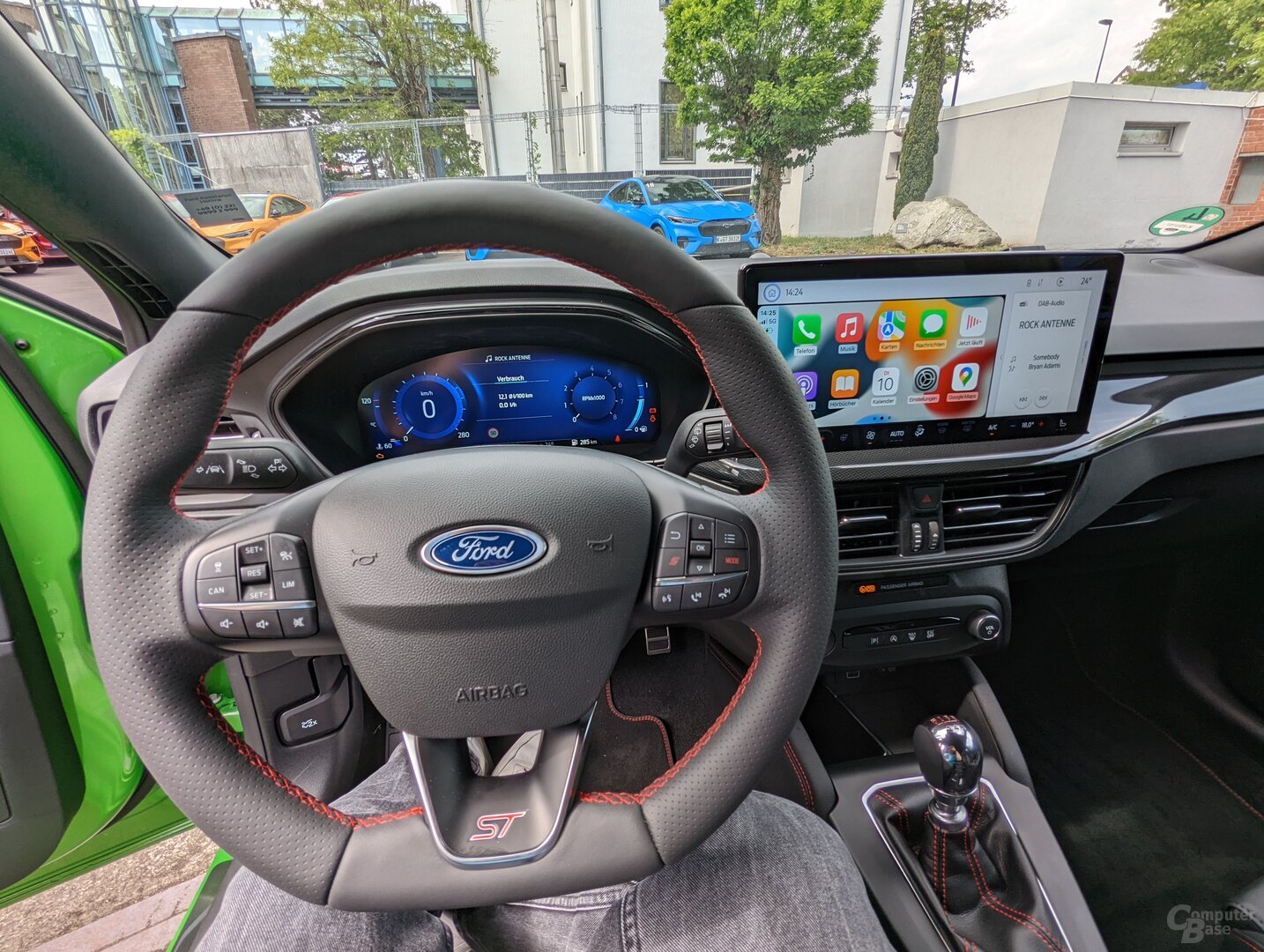
Sync 4 in focus is missing unique selling point
In the new Focus, however, the advantage of the Mustang Mach-E fizzles out, because there is space on the dashboard for a very large 12.3-inch, but rather traditional widescreen screen. Ford has opted for a variant that corresponds more to 21:9 than the classic 16:9. There is therefore significantly less space for Android Auto and CarPlay and both providers, especially Apple, and the users have to be content with a traditional view.
-
 Cockpit of the new Ford Focus
Image 1 of 4
 New Ford Focus cockpit
 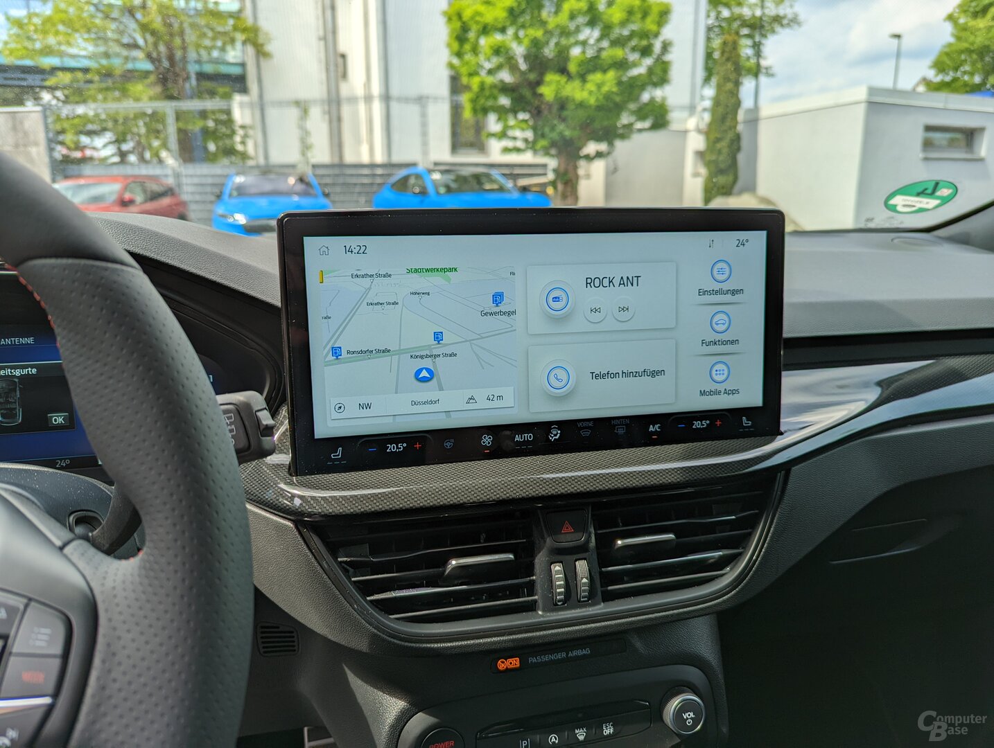 Sync 4 runs in focus on a 12.3 inch screen
 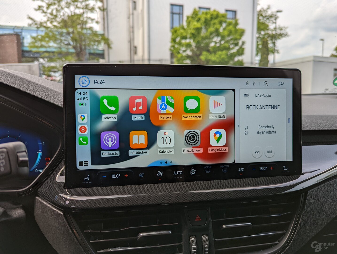 CarPlay in focus cannot be enlarged
 Sync 4 in the Focus also has a slightly different menu structure because the new screen format is simply not compatible with the Mustang Mach-E view. The Focus also shows that Sync 4 is not the same as the volume control on the display. In this vehicle class, a classic rotary control is used below the screen. Sync 4 in the Focus has static and dynamic elements, just like in the Mustang Mach-E, but at the top there is no longer an app drawer and direct access to the vehicle settings, for example. However, the bar for the air conditioning is retained, although it is somewhat narrower in the Focus. Instead, the Focus works with three tiles and access to the most important settings in an area to the right. If an app is displayed large, there is space for a small interactive tile of another app to the right. If desired, the applications can be changed by simply swiping up and down or moved into the large area by swiping to the left.
Conclusion< /h2>
Regardless of the format of the infotainment system, the overall impression in terms of speed, better menu structure and graphic quality of the Sync 4 displays must be considered. The current solution takes a huge step forward in all respects compared to the previous Sync 3. The CarPlay integration is particularly convincing. It's a shame that Ford hasn't promised to offer Sync 4 in every new model in the future. It is foreseeable that the Sync 3 will still be available before the Fiesta, although it is precisely this model that recently also received a large screen. If the Sync 4 is offered, it is part of the standard equipment, which according to the manufacturer cannot be implemented in all vehicle and therefore price classes.
ComputerBase has information on this article from Ford Received as part of an event organized by the manufacturer in Düsseldorf. The costs for arrival, departure and one night's hotel accommodation were borne by the company. There was no influence on the part of the manufacturer or an obligation to report.
This article was interesting, helpful or both? The editors are happy about any support by ComputerBase Pro and disabled ad blockers. More about ads on ComputerBase.