
New design for online Apple Store
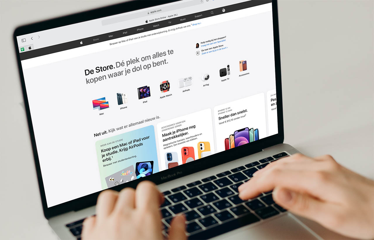
Previously, the Apple Store online was a bit hidden. You could find it by doing a search or browsing for a product. That has now become a little easier. On apple.com you will now find a separate link ‘Store’ in the navigation bar. If you click on it, you will see the new appearance. At the top you'll find images of Apple's major product lines, from Mac to AirPods. These products sometimes have their own Store page, explaining which products and additional accessories are available. You'll also find information about support, buying arguments, tips and the like on the main page.
The fact that the Apple Store went offline gave the impression that new products were coming, but that turned out not to be the case. It is exactly the same offer, but now presented slightly differently. Apple makes extensive use of blocks with rounded corners. Is it clearer? You can judge that for yourself. The page for the iPhone has to be scrolled very far sideways for some info because there are a lot of blocks on one line, while on other lines (such as about saving) there is only one block.
![]()

The new design is reminiscent of the Apple Store app. You navigate by scrolling horizontally, something that feels more logical in an app than on the desktop. If you decide to buy one of the products shown, you will arrive at the usual product page, which has remained exactly the same.
With the redesign, Apple is well in time for the upcoming stream of new products, which are expected before the fall. In addition to the iPhone 13, new MacBook Pros, AirPods and iPads are also expected.