

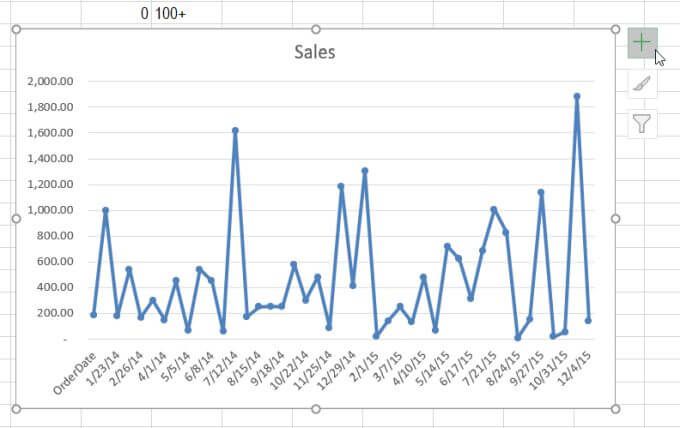
When you create line charts in Excel, you’re plotting data points along an X and a Y axis. This is useful for trending data over time, but what if you also want to trend how far those data points are from their “ideal” or how much they vary over time?
Trending margin of error and standard deviation is the most common reason people use the error bar feature in Excel charts. When you add error bars in Excel, you can view a standard error or deviation for every marker in the chart.


However, you can use error bars for a variety of purposes. Basically, anytime you want to include high and low points alongside individual data points, error bars can help.
Error bars are available in Excel for area, bar, column, line, scatter, and bubble charts.
Margin of Error & Standard Deviation
Before you can learn how to add error bars in Excel, it’s important to understand what both margin of error and standard deviation are.
- Margin of error is the “uncertainty” of the data point. This is commonly used in statistics when the data is from a sample that makes up a larger population. The margin of error tells you how far the data from that sample could vary from the “real” result for the entire population.
- Standard deviation is a component that’s used to calculate margin of error. The standard deviation is a measure of how spread out your data is. It tells you how much the data points are spread out around the overall average or mean of all data points.
You could calculate margin of error and standard deviation for yourself (Excel even provides standard deviation functions). Or, you can add error bars in Excel and let Excel do the calculations for you.
How To Add Error Bars In Excel
To add error bars in Excel, you need to start with an existing graph you’ve already created.
1. To get started, click on the chart and then select the Chart Elements button (the + symbol) at the upper right corner of the chart.


2. Check the Error Bars box to enable error bars in your graph. Then, select the arrow to the right of the Error Bars selection.


3. The pop-up box you see provides you with several options to configure the error amount that the error bars will display in the chart.
Before you can select one of the preconfigured options, it’s important to understand what each option means and how it works.
Error Bar Options In Excel
You can choose from three pre configured error bar options in Excel.
- Standard Error: Displays the standard error for each data point
- Percentage: Excel calculates and displays the specific error percentage for each data point
- Standard Deviation: Excel calculates and displays the standard deviation (one value) for all values
The actual calculation for standard deviation is somewhat complex and beyond the scope of this article.
If you want to calculate the standard deviation yourself and display that value instead you can do that.
In the error bar dropdown box, select More Options at the bottom of the list. This will open the Error Bar Options window. Select the graph icon at the top to switch to the Vertical Error Bar options.


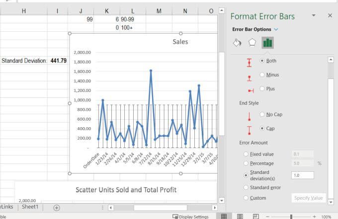
Under Error Amount, you can select Fixed value, Percentage, or Standard deviation(s) and type a value into the number field to specify those amounts. Choose Standard error to display just the standard error for all data points.
Or, you can select Custom, and choose your calculated standard deviation from your spreadsheet.


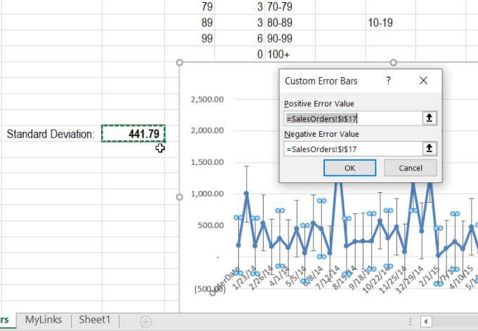
Select the cell with the standard deviation calculation for both the Positive Error Value and the Negative Error Value.
This displays the constant value that represents the overall deviation of data points. This could potentially be a wide range (like in the example above), so you might have to adjust the y-axis scale to the lower end of the range so it doesn’t display below the x-axis.
Customizing Error Bars In Excel
Using the Custom Error Bars feature is even more useful if you’ve calculated the margin of error in your spreadsheet. This is because the error bars will then display the range of values above and below each data point in the chart that represent the range of where the error lies at every point in the line graph.
Other custom error bar options that let you fine-tune how these bars display:
- Direction: Display the error line either only above (Plus), only below (Minus), or above and below (Both).
- End Style: Choose Cap if you want a small horizontal line at each end of the error bar, or choose No Cap if you only want the vertical line.
If you select the paint icon or the pentagon icon, you’ll see many other ways you can customize how error bars look in Excel.


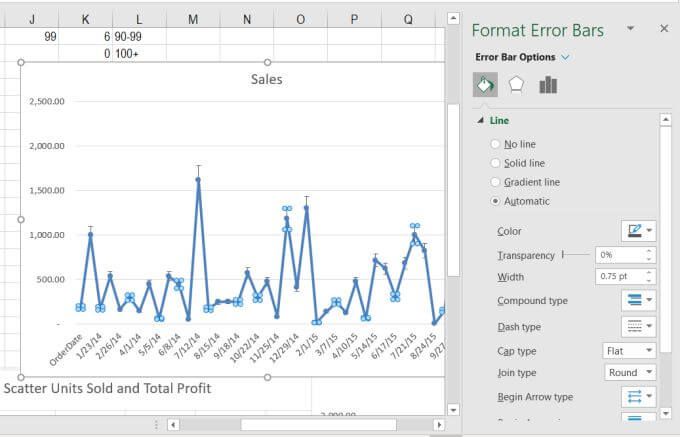
These include changing the error bar line type and color, transparency and width, and much more. Most people leave these settings as default, but know that they’re available if you want to fine tune how your error bars display in your chart.
Should You Add Error Bars In Excel?
Usually, error bars aren’t necessary on graphs unless you’re performing statistical calculations and need to show the error size that exists for the sample data set you’re analyzing.
Error bars are actually very important when you’re trying to convey correlations or conclusions using data, so that your audience understands how accurate those calculations are.