
Yesterday, I wrote about controlling a WeMo switch using Alexa and today I wanted to write about how you can export the energy usage data from a WeMo Insight switch to Excel. The WeMo Insight switch generates a lot of detailed information that is really useful if you’re trying to figure out how much energy certain devices or appliances are using in your home or office.
Even though the app data is great, you can export 45 days’ worth of far more detailed data to Excel and then do whatever you like with it: create charts and graphs showing which days the most energy is being used, how many hours the device is in standby mode vs on, etc.
In this post, I’ll talk about the process for exporting the data and then go over how the data is organized in the Excel spreadsheet. I’ll also show you how to make a quick chart to graph out the energy usage.
Export Energy Data from WeMo
By default, the WeMo app will give you high-level energy usage data like how long the device was on today and on an average day, the estimated monthly cost and the average and current wattage usage.

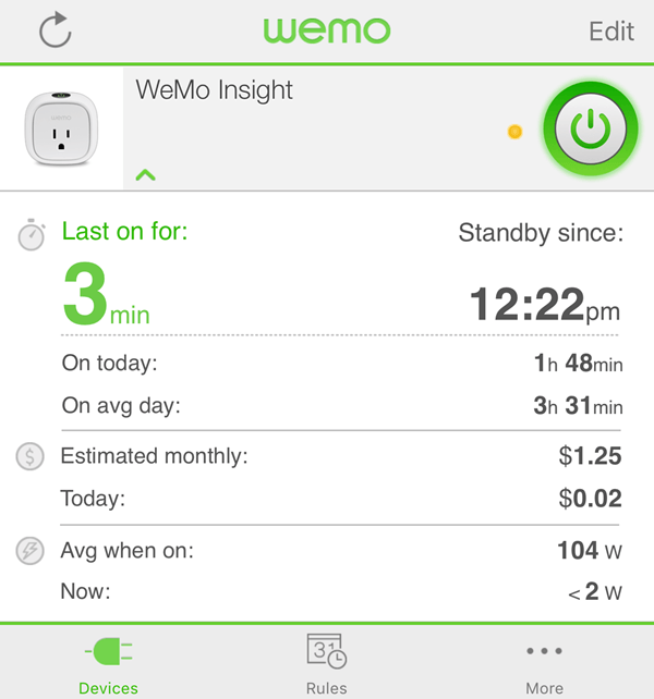
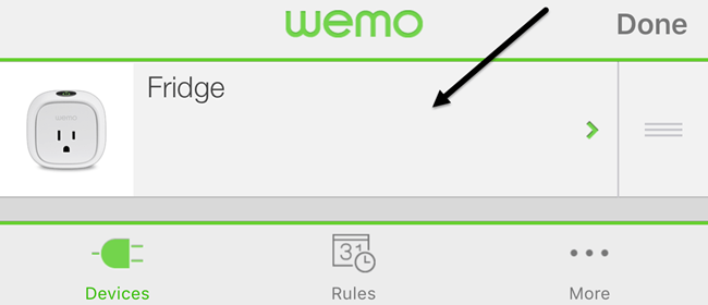
This is good enough for most people, but if you are a data geek and you love using Excel, you’ll love the fact that you can export so much extra data out to analyze on your own. To do this, we need to tap on the Edit button at the top right of the WeMo app. The switches will change how they are displayed and you should tap on the WeMo Insight switch.

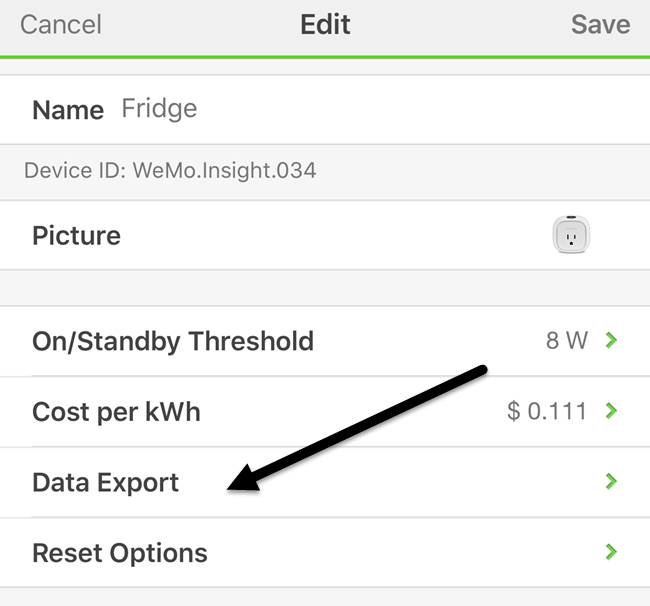
On the next screen, you’ll see a couple of options at the bottom, but the one we are interested in is Data Export. Some of the other options I’ll also explain later on as they can affect what data is exported.

Finally, on the last screen, type in your email address and then tap on Export Now. This will immediately send you an email with a CSV attachment containing all data for the device over the last 45 days.

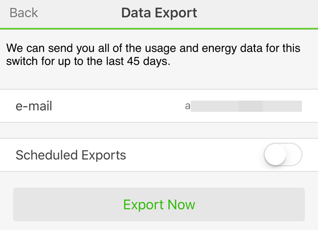
If you like, you can also setup scheduled exports on a daily, weekly or monthly basis. Since data is only kept for 45 days, it’s a good idea to export the data once a month, so that you don’t lose any data if you forget to export manually.

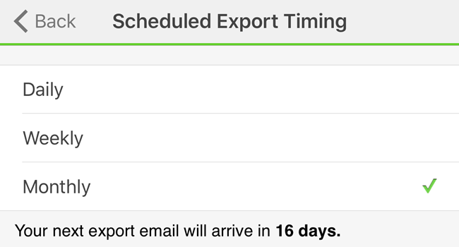
I also suggest using the monthly frequency because the way it works right now, ALL the data for the last 45 days is sent every time you perform an export. It’s not like the data is reset or anything like that. Eventually, you’ll also have to create a master worksheet and copy and paste the data from the newer spreadsheets into the older ones if you want more than 45 days’ worth of data in a single spreadsheet.

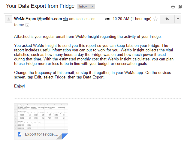
In the email, the name of the file will be Export for devicename. Since it’s a CSV file, you can open it in Google Sheets, Excel or a host of other programs if you like. For simplicity, I will be using Excel. Now let’s take a look at the spreadsheet.

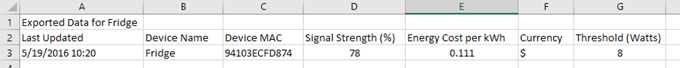
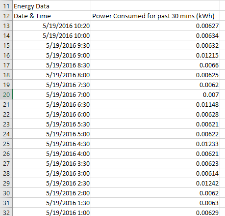
At the top, you’ll get some basic information like the last updated date and time for this energy report, the device name, some MAC ID, the signal strength of the WeMo device and then the Energy Cost per kWh and the Threshold (Watts). These last two values can be changed in the app on the screen where you tapped on Data Export. So the estimated monthly cost that WeMo gives you is based on this .111 per kWh value, but your energy costs may be different.
The best way to figure this out is to look at your energy bill and divide the total Electric Amount by the total kWh Used. You should only be looking at the Electric Details part of your bill, not the gas details. Here’s an example of my electric bill just to make it clear:

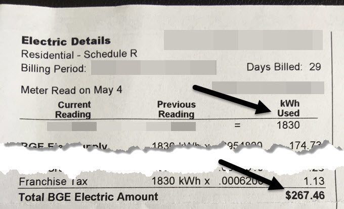
So here, I would take $267.46 and divide it by 1830 kWh Used and that gives me around .146, which is 14.6 cents per kWh as the cost. So now I go into the WeMo app and change it from .111 to .146 and that will give me a very accurate estimate of my monthly cost for this device.
In addition, you can adjust the Threshold value, which basically dictates whether the device is On or in Standby mode. By default, this value is set to 8 Watts. If the device uses less than that, it is considered in standby mode. I’m no electrical engineer and I’m not really sure what the best value for that is, so I just left it at 8w.


Below that is the daily usage summary section, which breaks down key stats by day. You can see time on, time in standby, average power consumption over the day, and the day’s cost. If you want to see total power consumed for the day, just create a formula and add Power Consumption (On) and Power Consumption (Standby) for each row. Finally, at the bottom, you get a breakdown of usage by half-hour.

Depending on how many days’ worth of data you have, this can add up to quite a lot of rows of data. This will also allow you to create nice graphs to see energy usage over time. In my opinion, the best chart for viewing this type of data is an X Y Scatter plot. If you select the two columns of data, including the headings, click on Insert – Chart, and choose X Y Scatter, you’ll get something like this:

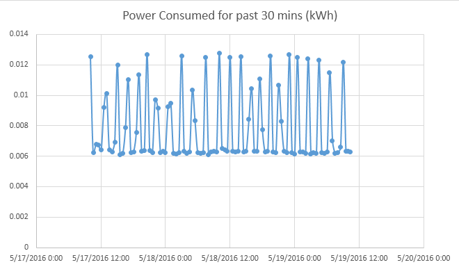
As you can see, my fridge uses around .006 kWh when not running and jumps to about .012 kWh when cooling. It also alternates between these states all day and night. Usage by other devices will probably generate different looking charts.
Note that it’s a good idea to reset the WeMo if you decide to move it to another location to track data about a different device. If you don’t, you’ll get data from two different devices, which will make the data useless unless you remember the exact day you moved the switch.
Overall, the WeMo Insight switch is worth the cost if you are a data junkie. In my opinion, you really only need one of these around the house to track different devices. Once you have a couple of weeks’ worth of data for one device, it’s not really going to change all that much, so you can then reset the data and start tracking another device. If you have any questions, feel free to comment. Enjoy!