
One of the most common types of graphs people create in spreadsheets, whether it’s Excel or Google Sheets, is the line graph.
Line graphs are easy to create, especially from one set of data, but you can also create them from two or more sets. This will generate several lines on the same graph.
In this article you’ll learn how to make a line graph in Google Sheets, whether you’re working with one set of data or several.

Make a Single Line Graph in Google Sheets
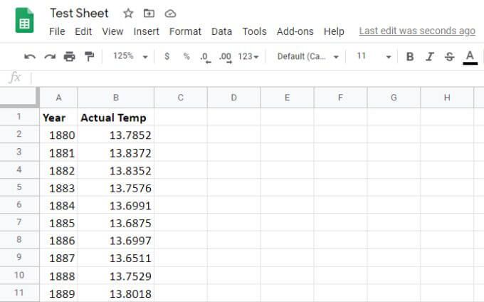
The easiest format to have your data for creating a graph is two columns. One column will serve as your x-axis values, and the other will become your y-axis values.
It doesn’t matter if the data is typed into these cells or the output of other spreadsheet calculations.

Take the following steps to create your line graph.
1. Select both columns, all the way down to the last row of data.
2. Select the chart icon toward the right side of the row of icons in the Google Sheets menu. This will automatically generate the chart in your sheet using the data you selected.

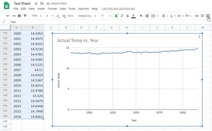
Google Sheets is intelligent enough to create the chart title from your column headers. It also places the first column along the x-axis with the correct label, and the second column along the y-axis with its own label.
Making a Multi-Line Graph in Google Sheets
To make a line graph in Google Sheets from multiple sets of data, the process is roughly the same. You’ll need to lay out the data in multiple columns, again with the x-axis data in the leftmost column.


To create the line graph from this data:
- Select all three columns down to the last row of data.
- Select the chart icon at the right side of the icon bar in the menu.

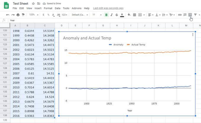
Just as before, this will automatically generate the multi-like graph. This time you’ll see the second and third column of data appear as two lines (two series) in the graph.
Note all of the following are generated automatically:
- Graph title comes from the headers for the second and third column.
- Series labels also come from the column headers.
- X-axis is generated from the first column data.
- Y-axis is generated from the range of the second and third column data.
As you can see, the graph is a single-scale. This means the max and min range will default to a wide enough range that both series of data can be displayed on the one graph.
The good news is that you aren’t stuck to the default graph settings. It’s possible to customize it so that it looks exactly the way you want it to.
Formatting a Line Graph in Google Sheets
To update the appearance of your chart, hover your mouse over it and you’ll see three vertical dots in the upper right corner.
Select the dots, and select Edit chart from the dropdown menu.

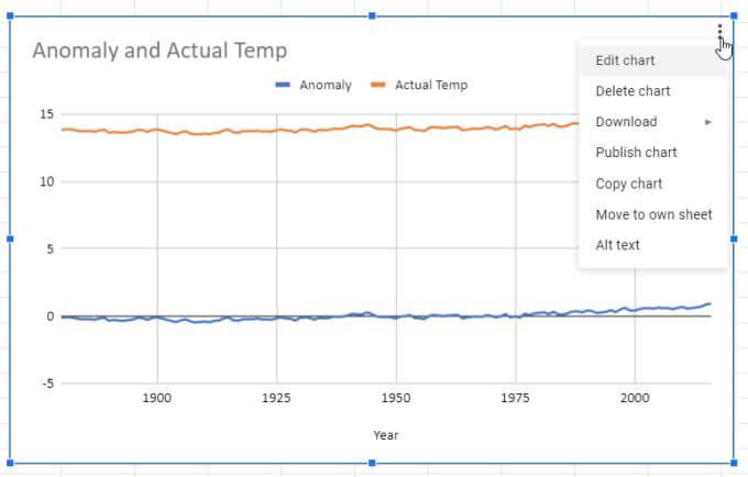
A window will appear on the right side of the spreadsheet. There are two tabs you can explore. One is Setup and the other is Customize.
Select Setup and you’ll see a variety of other chart styles to choose from.

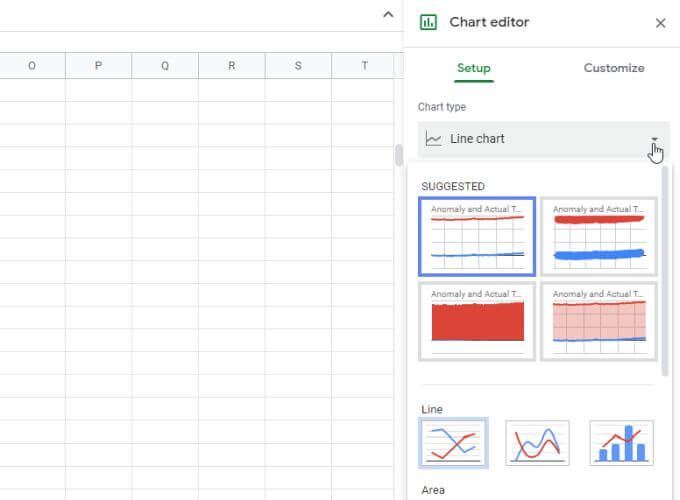
You’ll see several line chart styles, and you can also change the chart to something else like bar, pie, or even a combination of several styles.
For example you can choose a combination line and bar chart, which will use one column for the line and another for the bars. Each type of chart has its own purpose, depending on what data you’re visualizing and how you want to compare the data.
The Customize Section
To format the line graph you’ve created, select the Customize tab.
In the first section you’ll see the Chart style option. You can play around with the different layout options. One of the more common ones is Maximize, which creates the smallest scale possible that both sets of data will fit into.

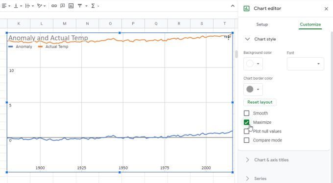
This is a way to zoom in on your data as much as possible without losing either data set.
Other options include:
- Smooth: Apply a smooth function within the line chart to reduce noise in your data.
- Maximize: Reduces padding and margins.
- Plot null values: If there are empty cells (null values) selecting this will plot them, creating small breaks in the line where there are null values.
- Compare mode: Displays the data when you hover over the line.
The Series Section
The next important section to know about is Series.
This is where you can adjust icons that represent individual data points (choose any shape from the list). You can also adjust the size of those icons and axis line thickness.

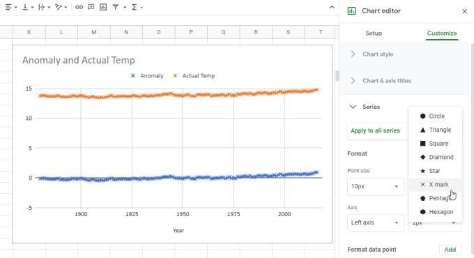
Lower down you’ll also see options to add data bars, data labels, and a trendline to your Google Sheets line chart.
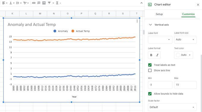
Horizontal and Vertical Axis Sections
Use the Horizontal axis and Vertical axis sections to adjust things on each axis like:
- Label font and size
- Label format (bold or italics)
- Axis text colors
- Whether to treat labels themselves as text
- Show an axis line or make it invisible
- Apply a factor to each axis scale
- Apply a logarithmic scale
- Adjust the number format if it hasn’t been applied in the data
Of course you’ll also see the option to manually set the max and min limits only for the y-axis scale.

Making Line Charts in Google Sheets
When you make a line chart in Google Sheets, it automatically appears on the same sheet as your data, but you can copy the line chart and paste it into another sheet tab of its own. It’ll still display the source data from the original tab.
You might be tempted to plot data in graphs or charts in Excel. But line charts in Google Sheets are much simpler to create and customize than in Google Sheets. Options are straightforward and the customization is much more intuitive. So if you ever need to plot any data in a line graph format, try it in Google Sheets first.