
Ever had a worksheet of data in Excel and quickly wanted to see the trend in the data? Maybe you have some test scores for your students or revenue from your company over the last 5 years and instead of creating a chart in Excel, which takes time and ends up eating up an entire worksheet, some small mini-charts in a single cell would be better.
Excel 2010, 2013 and 2016 have a cool feature called sparklines that basically let you create mini-charts inside a single Excel cell. You can add sparklines to any cell and keep it right next to your data. In this way, you can quickly visualize data on a row by row basis. It’s just another great way to analyze data in Excel.
Before we get started, let’s take a look at a quick example of what I mean. In the data below, I have revenue from ten stores over the last six quarters. Using sparklines, I can quickly see which stores are increasing revenue and which stores are performing badly.

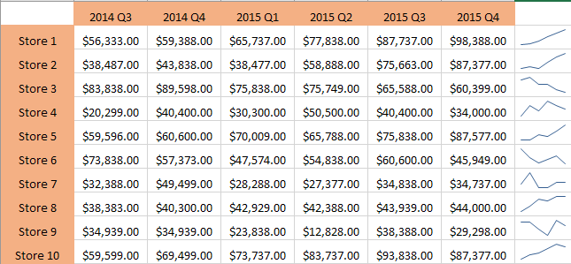
Obviously, you have to be careful when looking at data using sparklines because it can be misleading depending on what numbers you are analyzing. For example, if you look at Store 1, you see that revenue went from $56K to about $98 and the trend line is going straight up.
However, if you look at Store 8, the trend line is very similar, but the revenue only went from $38K to $44K. So sparklines don’t let you see the data in absolute terms. The graphs that are created are just relative to the data in that row, which is very important to understand.
For comparison purposes, I went ahead and created a normal Excel chart with the same data and here you can clearly see how each store performs in relation to the others.

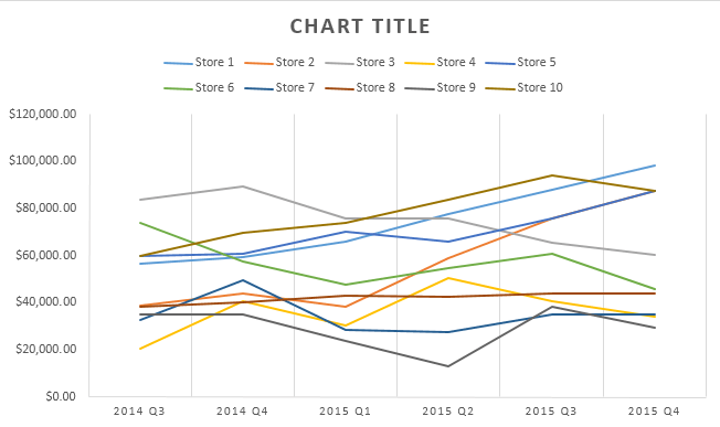
In this chart, Store 8 is pretty much a flat line as compared to Store 1, which is still a trending up line. So you can see how the same data can be interpreted in different ways depending on how you choose to display it. Regular charts help you see trends between many rows or data and sparklines let you see trends within one row of data.
I should note that there is also a way to adjust the options so that the sparklines can be compared to each other also. I’ll mention how to do this down below.
Create a Sparkline
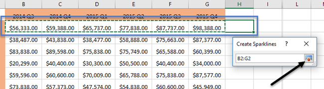
So, how do we go about creating a sparkline? In Excel, it’s really easy to do. First, click in the cell next to your data points, then click on Insert and then choose between Line, Column, and Win/Loss under Sparklines.

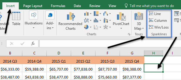
Pick from any of the three options depending on how you want the data displayed. You can always change the style later on, so don’t worry if you’re not sure which one will work best for your data. The Win/Loss type will only really make sense for data that has positive and negative values. A window should pop up asking you to choose the data range.

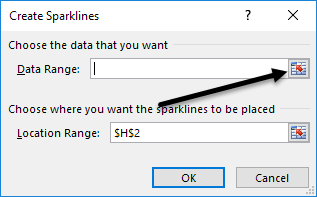
Click on the little button at the right and then select one row of data. Once you have selected the range, go ahead and click on the button again.

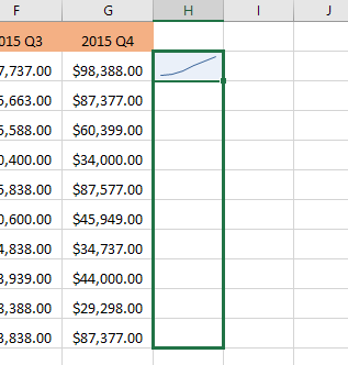
Now click OK and your sparkline or tiny chart should appear in that one cell. To apply the sparkline to all the other rows, just grab the bottom right edge and drag it down just like you would a cell with a formula in it.

Customizing Sparklines
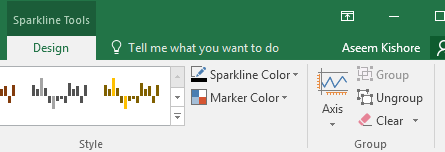
Now that we have our sparklines, let’s customize them! Firstly, you can always increase the size of the cells so that the graphs are bigger. By default, they are pretty tiny and can be hard to see properly. Now go ahead and click in any cell with a sparkline and then click on the Design tab under Sparkline Tools.

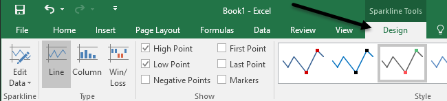
Starting from the left, you can edit the data if you like to include more columns or less. Under Type, you can change the type of mini chart you want. Again, the Win/Loss is meant for data with positive and negative numbers. Under Show, you can add markers to the graphs like High Point, Low Point, Negative Points, First & Last Point and Markers (marker for every data point).

Under Style, you can change the styling for the graph. Basically, this just changes the colors of the line or columns and lets you choose the colors for the markers. To the right of that, you can adjust the colors for the sparkline and the markers individually.

The only other important aspect of sparklines is the Axis options. If you click on that button, you’ll see some options called Vertical Axis Minimum Value Options and Vertical Axis Maximum Value Options.

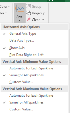
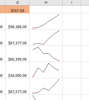
If you want to make the sparklines relative to all the other rows instead of just its own row, choose Same for All Sparklines under both headings. Now when you look at the data, you’ll see that you can compare the charts in terms of absolute values. I also found that viewing the charts in column form makes it easier to see the data when comparing all sparklines.

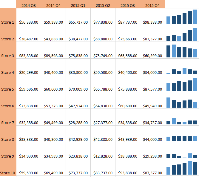
As you can see now, the columns in Store 1 are much higher than the columns for Store 8, which had a slight upward trend, but with a much smaller revenue value. The light blue columns are low and high points because I checked those options.
That’s about all there is to know about sparklines. If you want to make a fancy looking Excel spreadsheet for your boss, this is the way to do it. If you have any questions, feel free to post a comment. Enjoy!